- Blogs
- /
- Van Wrapping
- /
- Five Reasons Your Van...
It’s wise to take a step back and evaluate whether your van wraps are gaining exactly the brand exposure you’re looking for – which doesn’t always translate automatically into a sudden rush of interest. The effect of branding takes time. Once you’ve cemented your brand presence with a chosen target audience, you might see interest improve pretty quickly. Here we’re going to provide you with some free troubleshooting advice.
Let’s run through the top five reasons we see that van wraps aren’t getting noticed – and what you can do to resolve the problem.
1. Poor Quality Van Wraps
The number one reason a set of commercial wraps isn’t effective – they’re of poor quality.
It’s tempting to cut corners, opt for a cheap wrap material, or go for that unrealistically low price offer. Still, sadly it’s always going to end in a finish that isn’t representative of the quality you need to portray. Professional commercial wraps are fitted with skill, finesse, and exacting attention to detail (we’re allergic to air bubbles!).
Low-quality wraps can portray a rushed job and have the opposite impact you’re after, so take the time to use an accomplished team of skilled fitters, and you’ll see a world of difference.
2. Your Commercial Wraps Have Zero CTA
We get it; not everyone is a marketing guru. However, if you want your van wraps to make a mark, you MUST tell your customer what you want them to do! It’s like a benchmark of everyday marketing.
If you saw an ad on social media for a super-cool pair of kicks, you’d automatically expect to see a link, a Shop Now button, a Contact Us page, or something to show you how to purchase your fabulous new footwear.
You could be driving round in the most incredible wheels the M25 has ever seen, flaming hot artwork and bespoke designs. But, if there’s no phone number, no website, no information about what your business actually does, it’s never going to turn into bottom line profits.
Only the most prominent brands can use elusive marketing to grow their trade – for the rest of us, your van wraps need to spell it out and make it simple for a potential client to call you, visit your site, or check out your events.
3. Nobody Can Read Your Van Wrap Font
Another bugbear – because here at WrapUK, we’d always give you a heads up if we know from experience that your design is too small, too pale, or too intricate for anyone to make sense of!
Fonts on van signage are crucial to effectiveness. Most lorry wraps are seen at speed (ok, perhaps not on the M25), and it’s vital your target audience can quickly, clearly, see what it says. Even if you have a beautifully elegant swirly script on your website, that doesn’t mean it’s going to work on lorry wrapping. Check out the Wrap UK guide to Design and Font in Commercial Vehicle Wraps for a bit more guidance.
You don’t need to mess up your branding but can opt for something more linear and easier on the eye, ensuring you retain the key colours and design theme without producing van signage that isn’t legible. Examples include italic script, website or phone numbers across van doors, colours that are too close in shade to the background, or tiny writing that you cannot read from two lanes over.
4. Your Lorry Wraps Need Replacing
With proper care and maintenance, a professionally fitted wrap can last for years at a time. However, like all things, they will start to wear and tear as the rigours of the road start to have an impact. Like any business investment, van wraps will need upgrading from time to time – and if they’re looking like they’ve seen better days, now is the time.
Signs it’s time to replace your commercial wraps include:
-
- Fading and staining
- Peeling vinyl
- Bubbles (usually due to incorrect installation)
- Graphics that are starting to morph
You can find more information about choosing the right time to replace lorry wraps in our article When to Upgrade Your Van Wraps – Keeping Your Advertising in Top Shape.
The problem is that a worn set of van wraps gives the opposite impression you’re after. Customers have high expectations, and slick van signage indicates professionalism, quality, reliability, and ultimately that you’re a business a customer wants to buy from.
5. Putting Van Signage in the Wrong Place
Finally, you must make sure your van graphics are in the right place. Yes, it sounds obvious, but we probably see an example every week where style over substance creates a fantastic design that isn’t good marketing.
Great commercial wraps aren’t great by accident. Professional designs incorporate the vehicle’s style, size, and function, rather than splashing a logo on any part of the bodywork.
Think about:
-
- Which parts of your fleet people see most.
- Avoid putting contact info on high-impact areas, such as bumpers, where the print is likely to suffer from damage much faster.
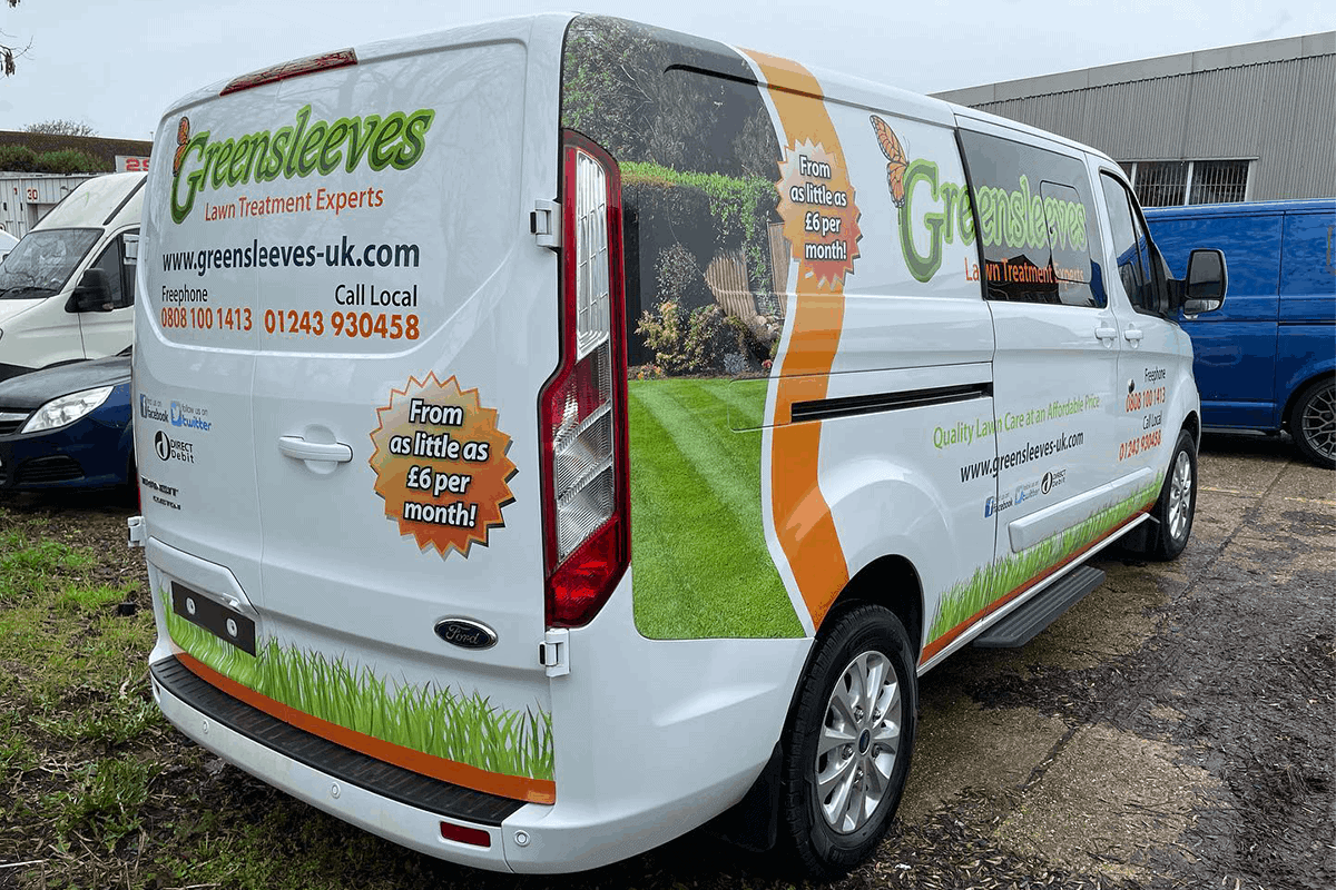
- Choose the rear panels for contact information, but make sure it isn’t warped across doors or windows.
- Use side panels for the largest graphics in your van wrap, where you’ve got the surface area to make the design work.
- Always use mirror print for text on the hood – that way, drivers in front can see the information in their mirrors.
It’s all about making life as easy as possible for your intended audience.
If you follow these tips, you’ll be able to work out whether your wraps aren’t having an impact because there is a flaw in the design, font, or placement of your key information, or if it’s time to revisit the design board.
Need more help working out how to transform your van signage into marketing that sells? Get in touch with us at WrapUK, we’re here to help.
VAN GRAPHICS Quote
Provide us some base information to get your quote ASAP.

