- Blogs
- /
- Wall Wrapping
- /
- How Important is Design...
There are a load of reasons why it’s well worth considering lorry and van wrapping. After all, if you’ve got a fleet out on the road every day, you have a perfect opportunity to showcase your services and get some marketing exposure.
That said, the design is crucial; and given that we’re not all gifted designers, the Wrap UK team has put together some tips and tricks to make sure your van wraps pack a punch! Stuck for inspiration? Not the foggiest about where to start? Get in touch, and we’ll help you decide on a fantastic design that delivers the right message.
Choosing the Right Type and Size of Fleet Wraps
 One of the biggest problems with sketchy van wraps is that they’re not quite the right size; you can have a small vinyl wrap applied to just one panel, or a part of a vehicle if you wish – but, be cautious about it looking like a half-done job!
There are a few ways to make sure you get this right:
-
- Make a list of the vehicles in your fleet you wish to wrap – and see if you can download car blueprint templates, or give us a ring if you need a hand with this. It helps since you can visualise exactly where your wraps will sit, which areas they will cover, and decide on which bits of your vehicles you want to put each part of your design.
- Have a quick inspection of each vehicle. If you’re after lorry wraps over areas of rust or damage, for example, it’s best to get that sorted before you invest in a vinyl wrap, as it won’t adhere properly (& we’ll always tell you if that’s the case!).
- Decide on your budget. There is a massive choice when it comes to commercial wraps – whether you want PWF wrap (platinum wrapping film), 3M wrap (high-quality, cost-effective), or Avery wrap (a light tack option) for example. Speak to our teams for advice about the best type of wrap for your commercial fleet or car, and we’ll point you in the right direction!
The last thing you want is a substandard wrap that isn’t suited to the type of vehicle or won’t last long enough if it’s been applied to vehicle damage. If you do your homework first, know what style and type of vinyl wrap are best, and have a budget that you know you can stick to, you’re off to a good start with choosing the right design.
Commercial Wrap Font Spacing, Shape and Readability
There’s a big difference between a globally recognised brand, and choosing a complex (but beautiful!) graphic that, unfortunately, nobody can read…
Graffiti fonts are a perfect example; they look swish, everyone thinks the design looks awesome on a mock-up, but the reality is that the people, who you want to see your fleet wraps and remember them, haven’t a clue what it says!
Commercial vehicle wraps should represent your brand and must be understandable, so if you pass by a potential client who wants to get in touch, it’s memorable:
- Decide what you want your wraps to say – keeping it simple is best.
- Remember that we’re talking about moving vehicles here when they’re not parked; the font needs to be super easy to read, and understand, without needing someone to take a photo or study it more closely!
- Fonts should be evenly spaced, so the letters aren’t squashed so closely together they’re hard to read, but not so widely spaced that they don’t instantly form a word to someone seeing your design for the first time.
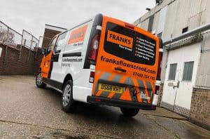
- Think about which parts of your fleet are most visible. Having contact info on the back is great since it’s visible to every driver that comes up behind a wrapped lorry. The side panels are the largest surface area, so this is the best position for longer words or more detailed graphics.
- Consider where the windows and doors are (if any) and make sure you design around them, without creating a wrap design that’s going to be broken up and lose impact.
- If you’re putting text on the hood, make sure it’s in mirror print! The people who see your bonnet will usually be looking at you in a mirror, so it makes sense to ensure they know what the wording says!
Memorable lorry wraps are great. Even if you’re driving past traffic on the motorway, or parked up in a layby, people passing can immediately see what you’re all about, and remember the company name if they’re looking for your service.
As a rough guide, if you’ve got words around three inches high, they are visible from about 7.5 metres. Letters closer to six inches tall can be read from around 10 metres away – the bigger the letters, the more people will see them.
Design Van Graphics That Resonate
Finally, when you know your budget, wrap size, what wording, fonts and text you want to include; you also want to think about creating a design that your customer wants to see. Just like any marketing, your audience is key.
-
- If you’re showcasing a luxury, refined brand, then cool colours and simple classic design schemes are perfect.
- For energetic, fast-paced brands looking for a more excitable audience, you want to use colour schemes with impact!
Colour is just as crucial as any font; and can make a great logo or slogan stand out from miles away (ok, maybe meters!) – or can turn a brilliant van graphic into a magic eye picture that’s impossible to decipher.
White letters on a black background are easy to read, but if you swapped out that for a red font, it would be tough to understand. If your company colours don’t work well on a lorry wrap, you can always change it up; use text boxes with a simpler colour scheme, and inject bright colour pops and more vibrant shades around them, for example.
It’s all about combining cool graphics with design iconography that can be easily read, even at speed, isn’t hard to understand, and denotes the emotion and energy that you want new customers to associate with your brand.
Trust us, spending a little time on testing out designs will pay dividends – with well thought out marketing that speaks volumes.
For help with designing your commercial vehicle wraps, or working out the best way to incorporate a colour scheme into your fleet, give the Wrap UK team a call.
VAN GRAPHICS Quote
Provide us some base information to get your quote ASAP.

