- Blogs
- /
- Van Wrapping
- /
- The Biggest Mistakes to...
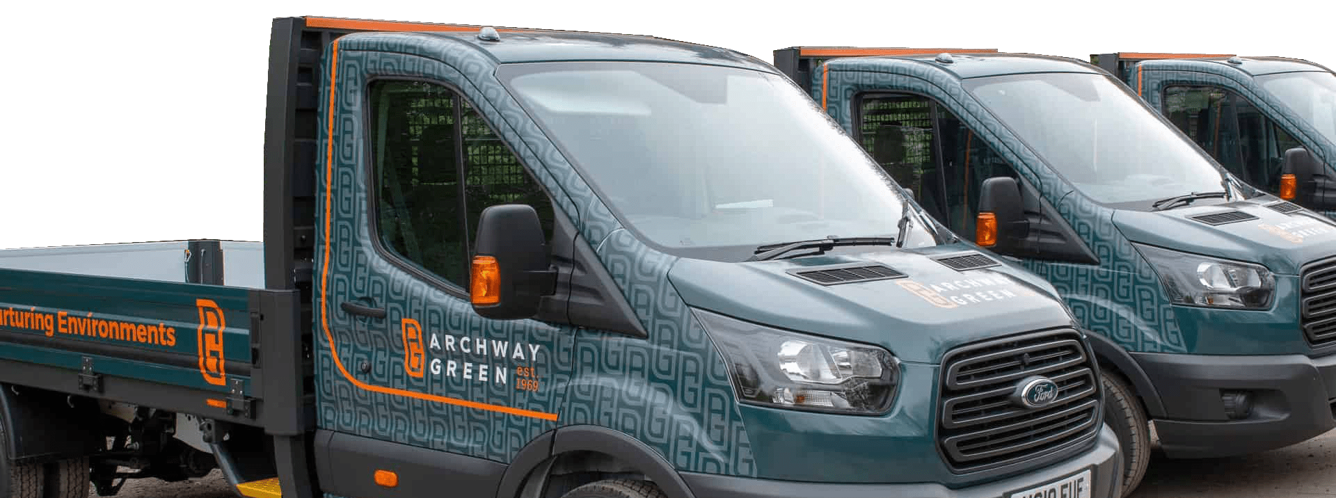
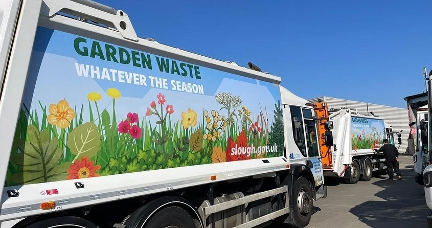
Adding a fleet wrap to company trucks and vans can be an excellent exercise in proactive advertising while presenting a polished and professional appearance to every client or business you visit and deliver to. However, the design of your fleet wraps is all-important!
A high-quality, sleek design can make your fleet vehicles stand out, attract attention, generate positive brand awareness and increase the enquiries you receive. Conversely, a poor design may have the opposite effect or make it difficult for people who spot your fleet to read the text or branding.
Today the WrapUK team runs through the most common vehicle wrap mistakes we come across on company vehicles, why they may influence the effectiveness of your commercial vehicle wraps, and our advice to ensure your new vinyl wraps look the part.
1. Van or Lorry Wraps That Are Confusing and Cluttered
It’s normal to want to include as much information as possible when you’re designing a wrap. Perhaps you have several locations, lots of departments or services, or want to showcase a whole range of flagship products to maximise the returns on your fleet wrap investment.
The issue here is that a complicated and overly busy wrap becomes very difficult to read and can detract from the key message you want to convey. Vinyl wraps work so well because they are eye-catching and noticeable, but a chaotic design often means that text becomes lost in a jumble of colours and images.
Our design team can help, looking at the core objective of your vehicle graphics design to pinpoint the best ways to communicate with potential customers without overloading your wrap with too many details.
2. Replicating the Same Wrap on Different Vehicles in Your Fleet
Businesses often have several vehicles within a fleet – perhaps a few company cars, a flatbed and artic, or vans and tow trucks, each with different bodywork, panelling and dimensions. It is essential that any fleet branding is configured to the exact make and model of the vehicle since using a design created for a different truck or lorry doesn’t work well.
For example, if you have vehicle graphics created for a transit van wrap and simply enlarge it for a truck, the logos and text won’t sit in the right places, will be off-centre, or will be pixelated and blurry if the design hasn’t been recreated to the same level of quality.
The best option is to adjust your wrap design to every vehicle, ensuring they present a consistent image. Even if your company has two commercial vehicles of a similar size, it’s often the case that models manufactured in different years will have contrasts in the shape of the hood, the placement of the lights, and the exact sizing of the doors.
3. Using Italic, Swirly or Hard-to-Read Fonts
We talk a lot about fonts in vehicle wrapping because getting the text wrong is the number one error! It’s best to stick to sharp, clear text that anybody can read – regardless of whether you use elaborate text or calligraphy in your general business branding.
If your company name, contact number, website or slogan are tricky to read at a distance or when travelling past or behind a vehicle on the motorway, it will become lost.
It’s also really wise to use wider fonts that don’t get swamped between blocks of colours and to consider the shade of the text, so it stands out. Fleet wraps are created for high visibility while moving, so if it’s only possible to read all of the text when your vehicles are stationary at lights or parked up, it may be time for a rethink.
4. Adding Low-Resolution Graphics and Imagery
Most businesses have a bank of digital assets they use on their websites, marketing literature and paperwork, often:
- Business logos
- Letterheads
- Email signatures
- Outdoor signage
While these graphics are all great to use in your fleet wraps, they must be optimised and potentially recreated in a high enough resolution that, when expanded to a large enough size to be prominent on the side of a vehicle, the image remains sharp and professional.
Grainy graphics can make even the most premium vinyl wrap look low quality, so if necessary, we’d recommend having your logo or business image re-done in full colour and with the precision necessary to look flawless.
5. Placing Key Icons or Contact Information in the Wrong Place
Perhaps this seems obvious, but all too often, we see vehicles on the motorway which have incredible wrap designs – but with the contact info, or the name of the company and the services it provides printed along the side panel, presumably because this part of the vehicle provides the largest surface area.
It’s essential to think about when and how people will see your vehicles. If you’re wrapping a delivery van, the greatest exposure you’ll get is when the van is driving between drop-offs within your local area. Therefore, the largest number of people who see the wrap will be behind the vehicle rather than passing either side or parking next to it.
There’s absolutely no reason to leave the side panels blank, but if you do the same for the rear of the vehicle, it can mean the overall impact of your fleet wrapping project isn’t quite as good as it could be.
Just as emergency vehicles print backwards on the bonnet, ensuring cars in front of them will know to give way or move aside when they read the text in their rear-view mirror, putting a little creative thought into how your wraps will be viewed can help ensure your design is spot on.
Designing High-Impact Fleet Wraps for Your Business Vehicles
Fortunately, all of the mistakes we’ve explored here are easy to rectify, even taking an existing vehicle wrapping design and tweaking it as required to produce the standard and finish you feel will best represent your company.
The ideal option is always to work with an experienced, talented design team who understand the principles and features of wrap design and can offer advice and guidance to ensure your completed wraps look professional, eye-catching and consistently on-brand.
VAN GRAPHICS Quote
Provide us some base information to get your quote ASAP.

